PROJECT
Betterway // Brand Identity
MY ROLES
- Naming
- Visual Identity
- Voice and Messaging
- Packaging
YEAR
2019 - 2023
COLLABS
DO tm
About
As the Co-Founder and Creative Director of Betterway, I set the vision and strategy for the brand. From concept to scale, I led the design and execution of all creative projects: from brand identity to website, product design, packaging, marketing material, copywriting, and content creation. Throughout the process I hired, oversaw, and collaborated with a web development agency and other creative freelancers.
A better way to ________ .
When our brand was born, we were very intentional about finding a name that didn’t corner us into a specific product. We decided to stay away from referencing pandas, bamboo, or toilet paper in the name and, instead, we went for a universal concept. Betterway: a memorable, simple name that embodies our mission as a company, can be applied to a vast array of products, and helps customers understand what our brand is all about, just by looking at the logo.
Activism as an act of love
The environmental challenges we are facing today are daunting. The impending threats are undeniably real, and the pressure to “do something about it” is prevalent. As consumers, the urge to make more conscious choices often arises from a place of guilt; but we believe that profound impact arises when the choice to take action comes from a place of love.
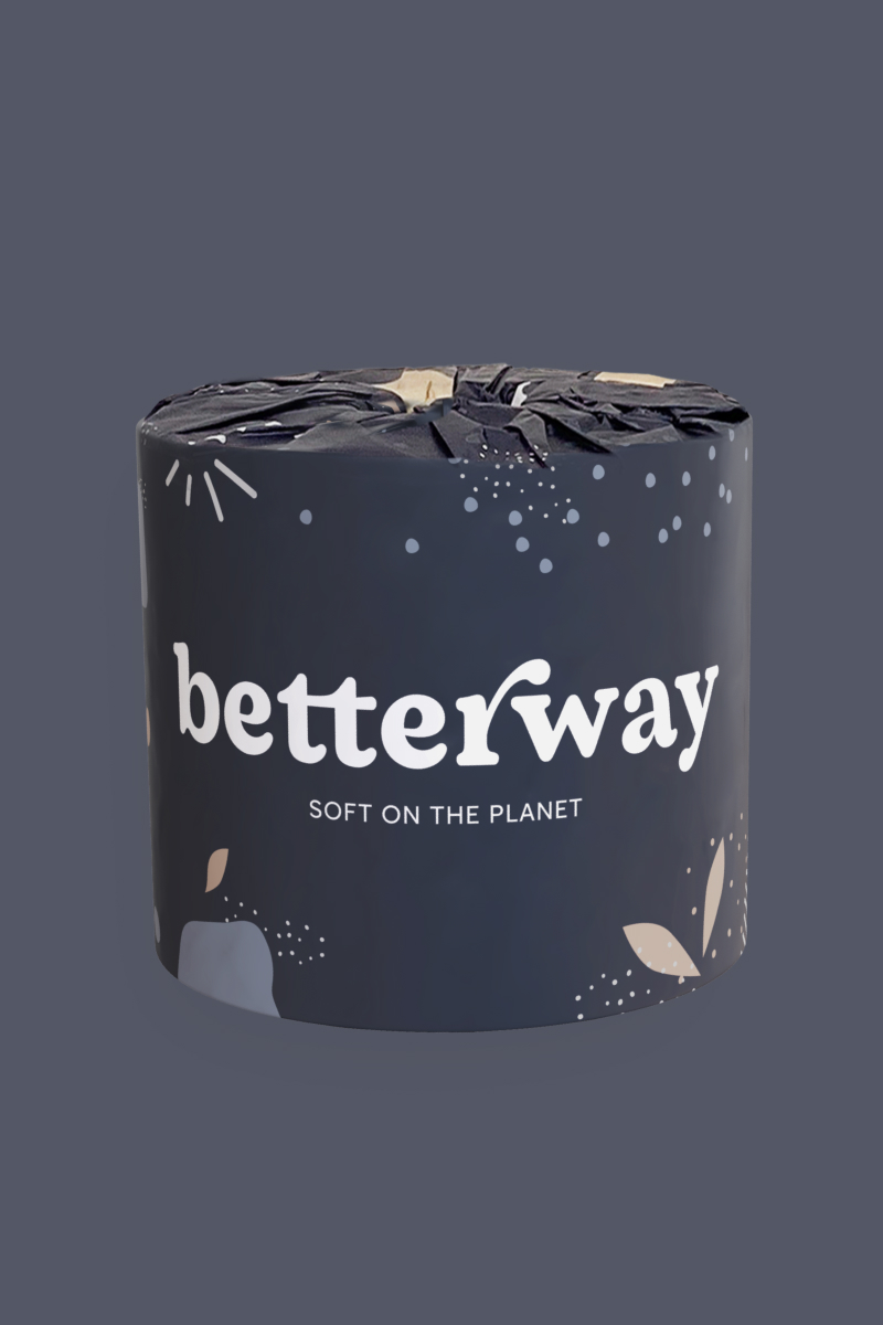
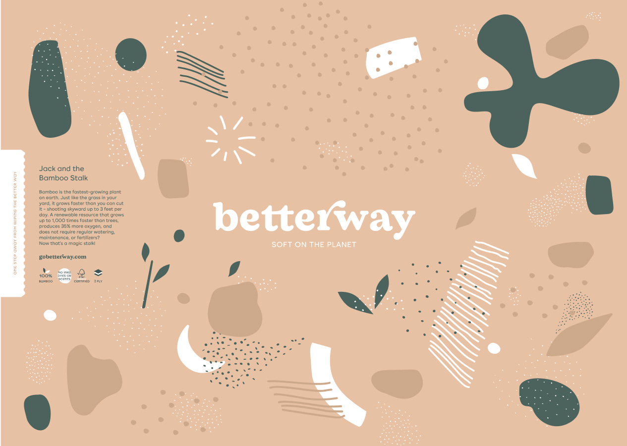
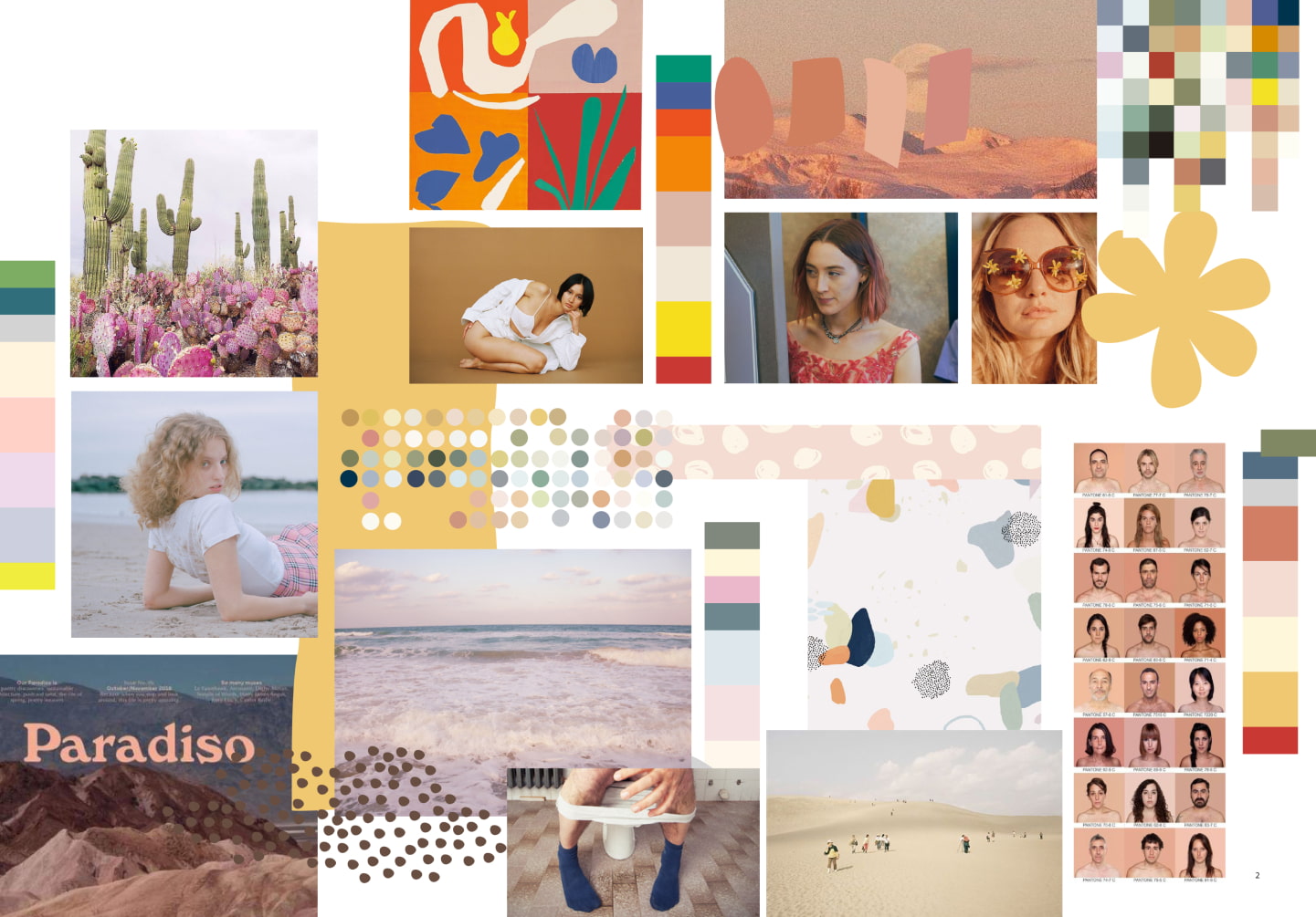
Many sustainability-driven brands opt for a polished, minimal aesthetic. I find that this level of sophistication can often be intimidating, leaving the customer with a sense of ”you can’t sit with us.” When developing the visual language for Betterway, it was important for me to create an identity that felt easy-going, inspiring, and inviting.
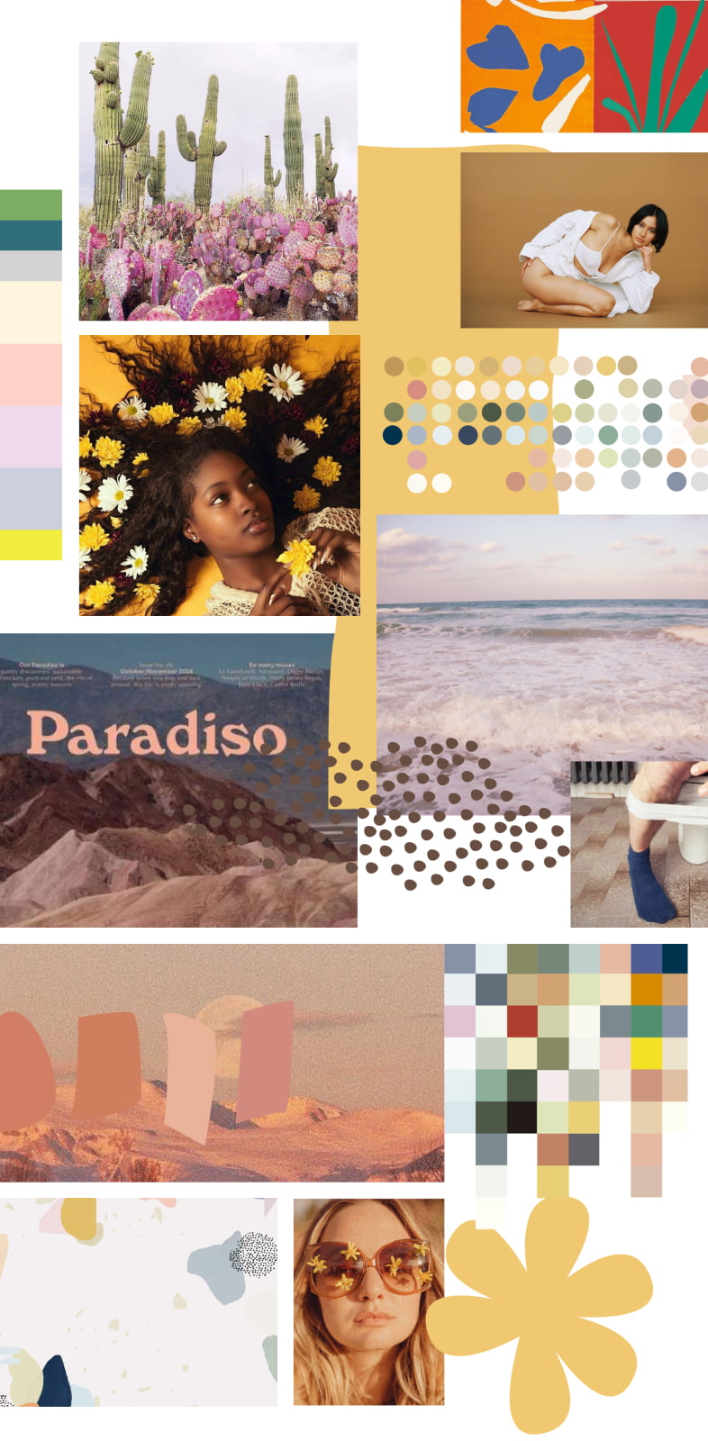
The 60s and 70s were decades of great activism. The counterculture generation was an era of profound changes that saw the emergence of an array social movements, including environmental protection. As serious as these movements were, they gave way to an environment of pushing boundaries, of experimentation, boldness, and playfulness.
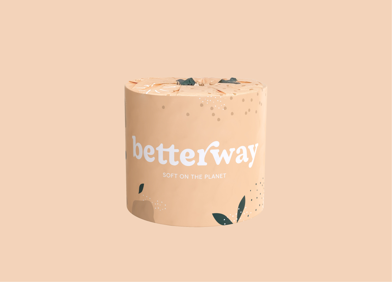
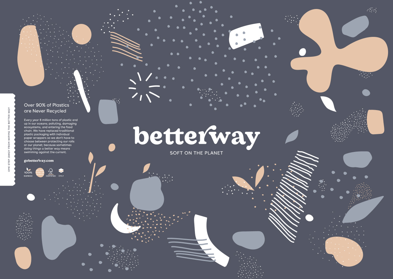
This was the energy that I wanted to bring forward in our brand identity. An homage to the inception of the environmental movement, presented with the playfulness and openness of the peace and love revolution. An invitation to fall in love with our planet, to learn about the issues we face in a way that feels approachable and unpretentious. All in the hopes of empowering people to take action, not from a place of guilt and fear, but from a place of genuine appreciation and care.
Better together
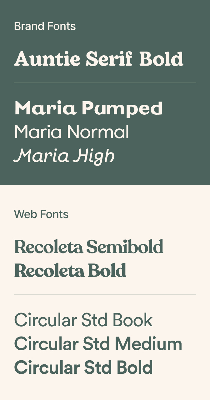
Auntie Serif (the font we chose for the foundation of our logo) was crafted by DO tm, the design studio we collaborated with. I immediately fell in love with this contemporary reimagining of the quintessential curvy typefaces from the 60s and 70s . The rounded, soft edges create a sense of approachability and fluidity that captures the playful and welcoming spirit of the brand.
To turn a typeface into a story, I connected the Ts and elongated the R. By crafting the illusion that the Ts are in a joined embrace and the R reaches out to its neighbor, the intention was to foster a feeling of unity. A sense of “we’re all in this together” that emphasizes the power of community when it comes to tackling the environmental challenges we are facing today.
A bio-inspired palette
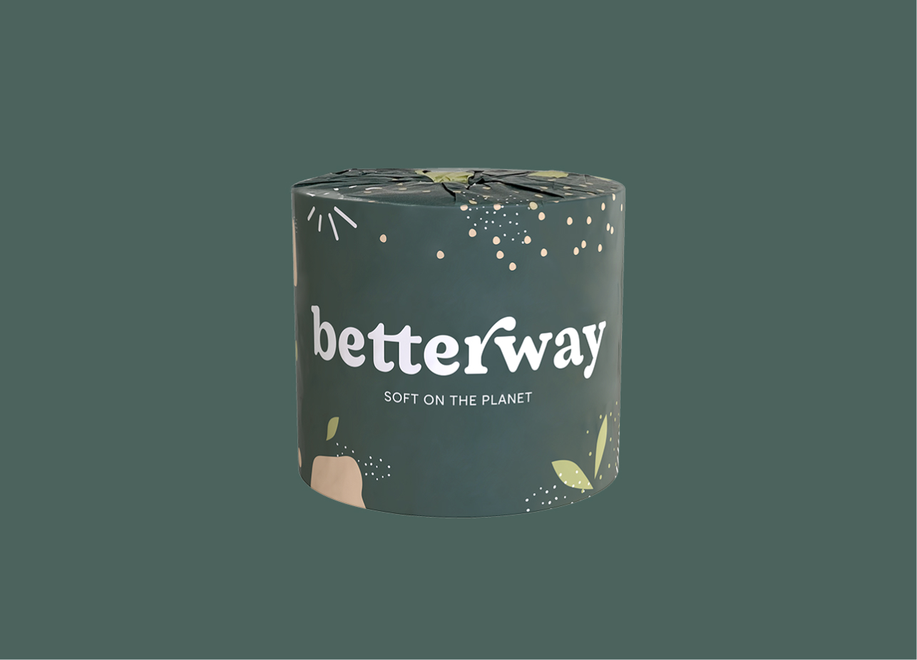
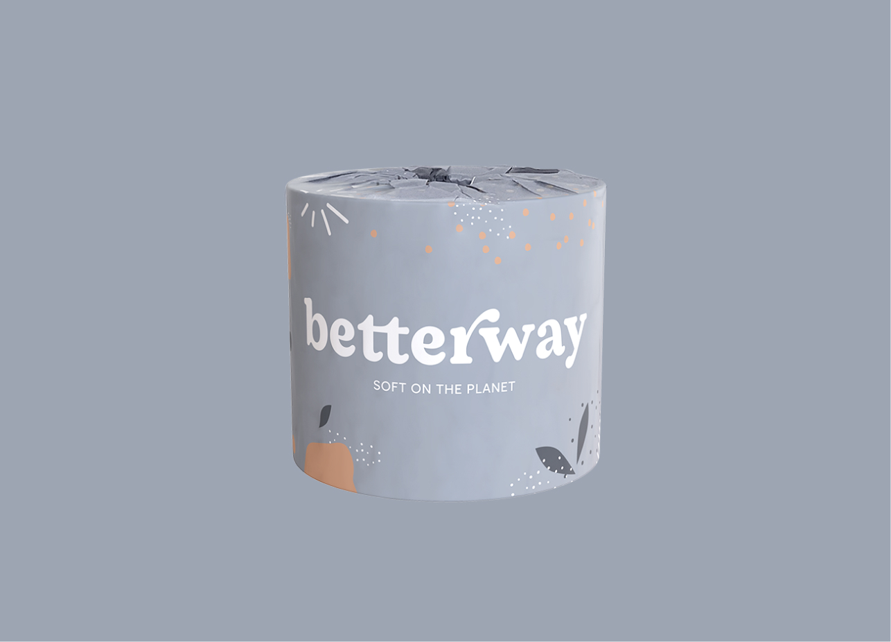
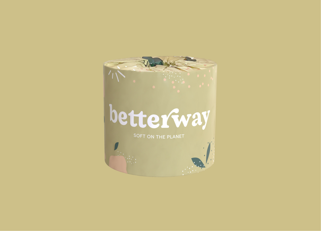
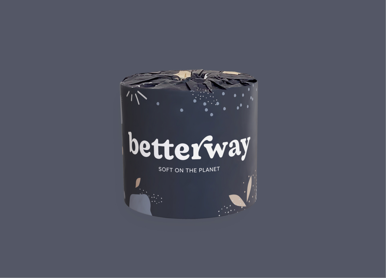
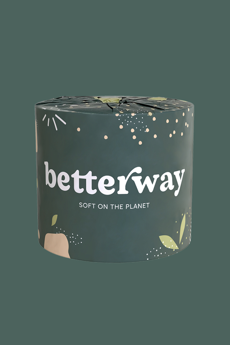
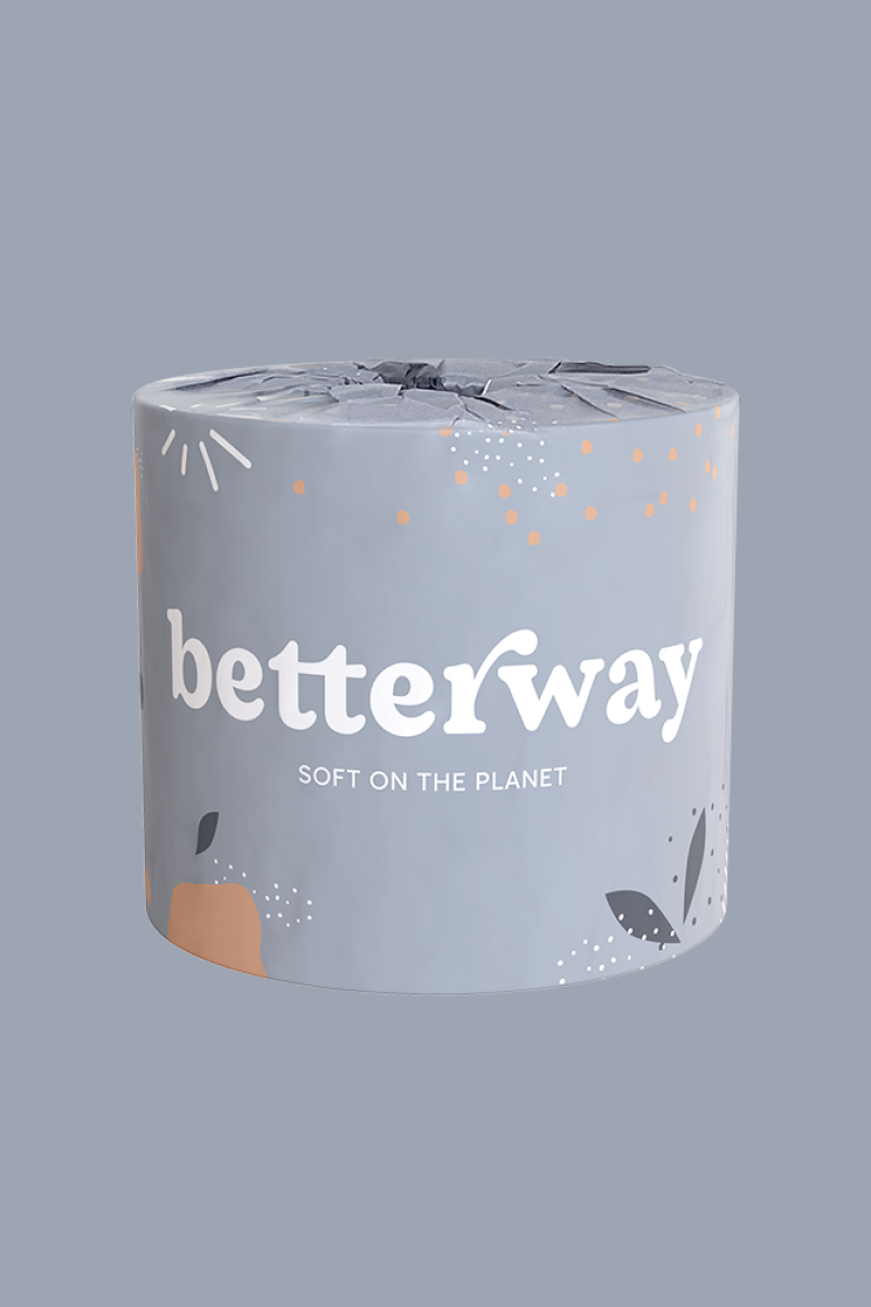
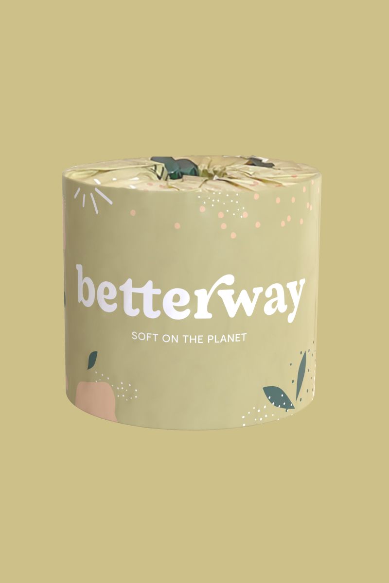
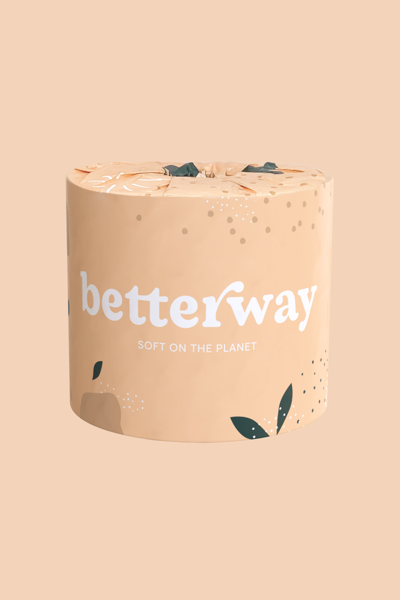
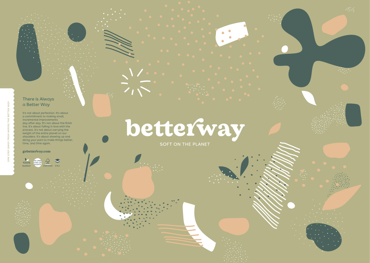
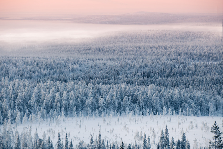
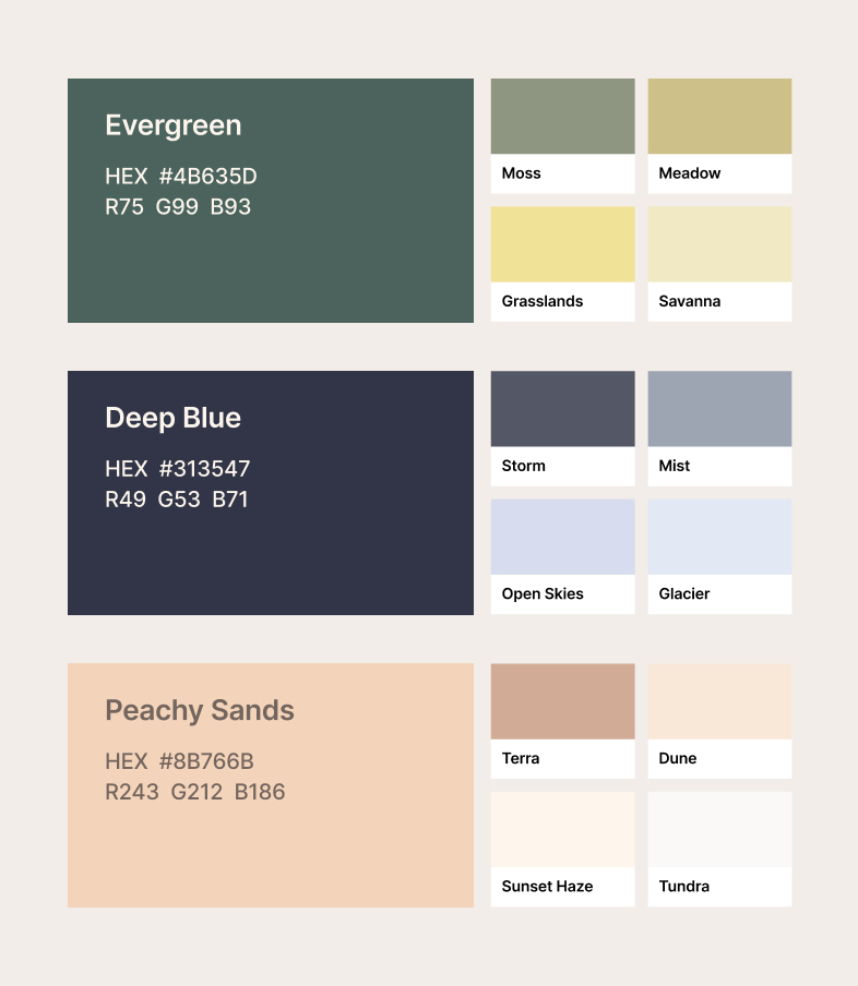
I’ve always found it strange that ”eco” brand palettes stick almost exclusively to greens and browns, as if those were the only colors found in nature. With Betterway’s color palette, I aimed to embrace the full vibrancy of nature’s spectrum. From the lush greens of dense forests to the serene blues of rivers and oceans, to the warm peach tones of arid deserts, each shade encapsulates the essence of a distinct ecosystem. An invitation for our audience to connect with the breathtaking richness of our planet’s diverse biosphere.
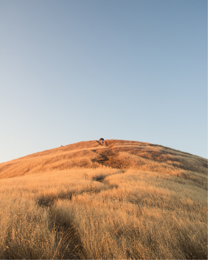


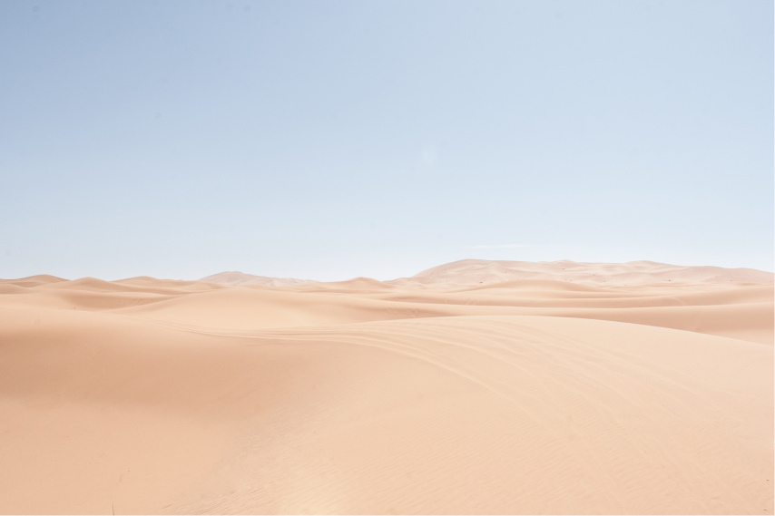
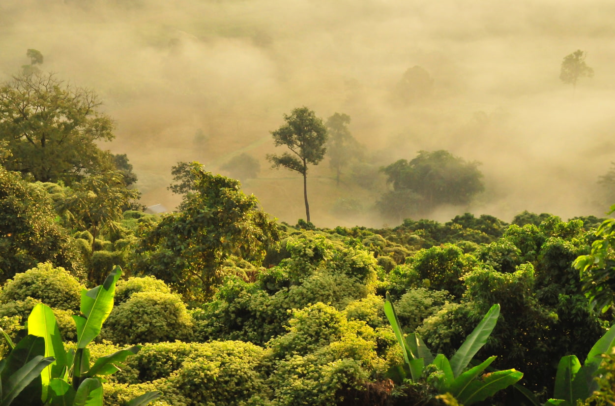
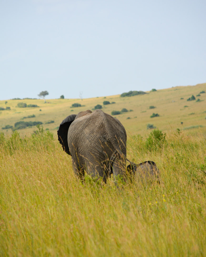


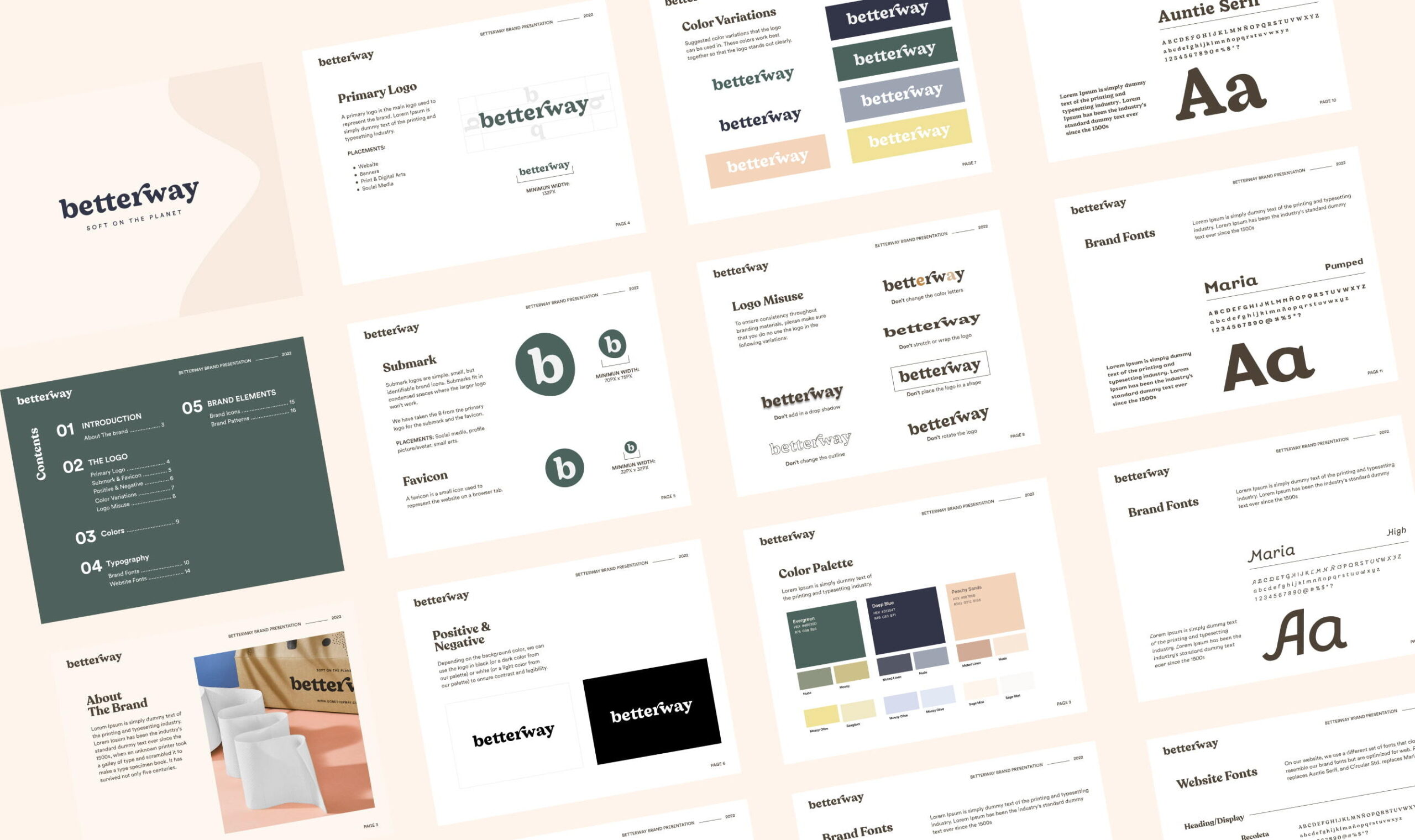
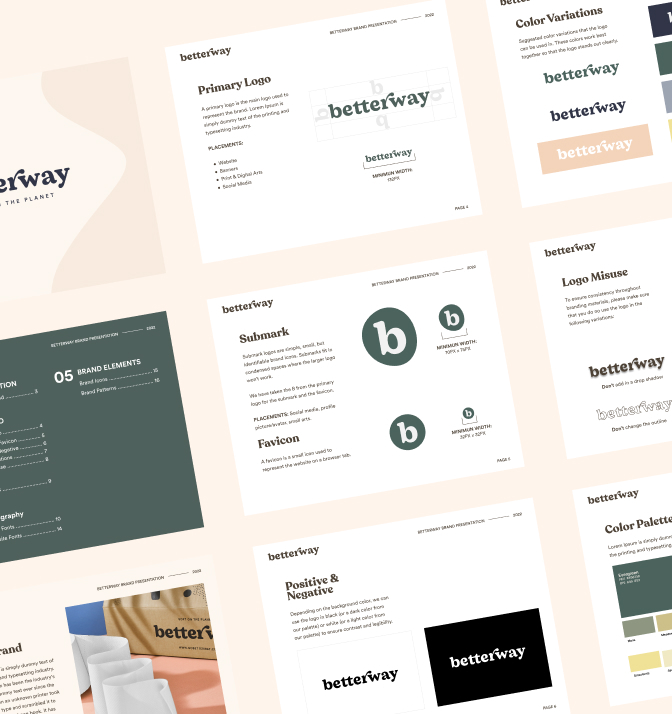 Betterway brand guidelines.
Caring and Encouraging
Betterway’s voice evolved naturally, guided by our intention to utilize the brand as a platform to inform and encourage people to care about their impact on the planet. Our voice is straightforward yet warm. We invite our audience to develop a sense of responsibility towards the environment while offering reassurance in their capacity to make better choices. Our messaging is a gentle nudge toward progress, a reminder that simple, small steps can lead to meaningful transformations.
Mission Focused
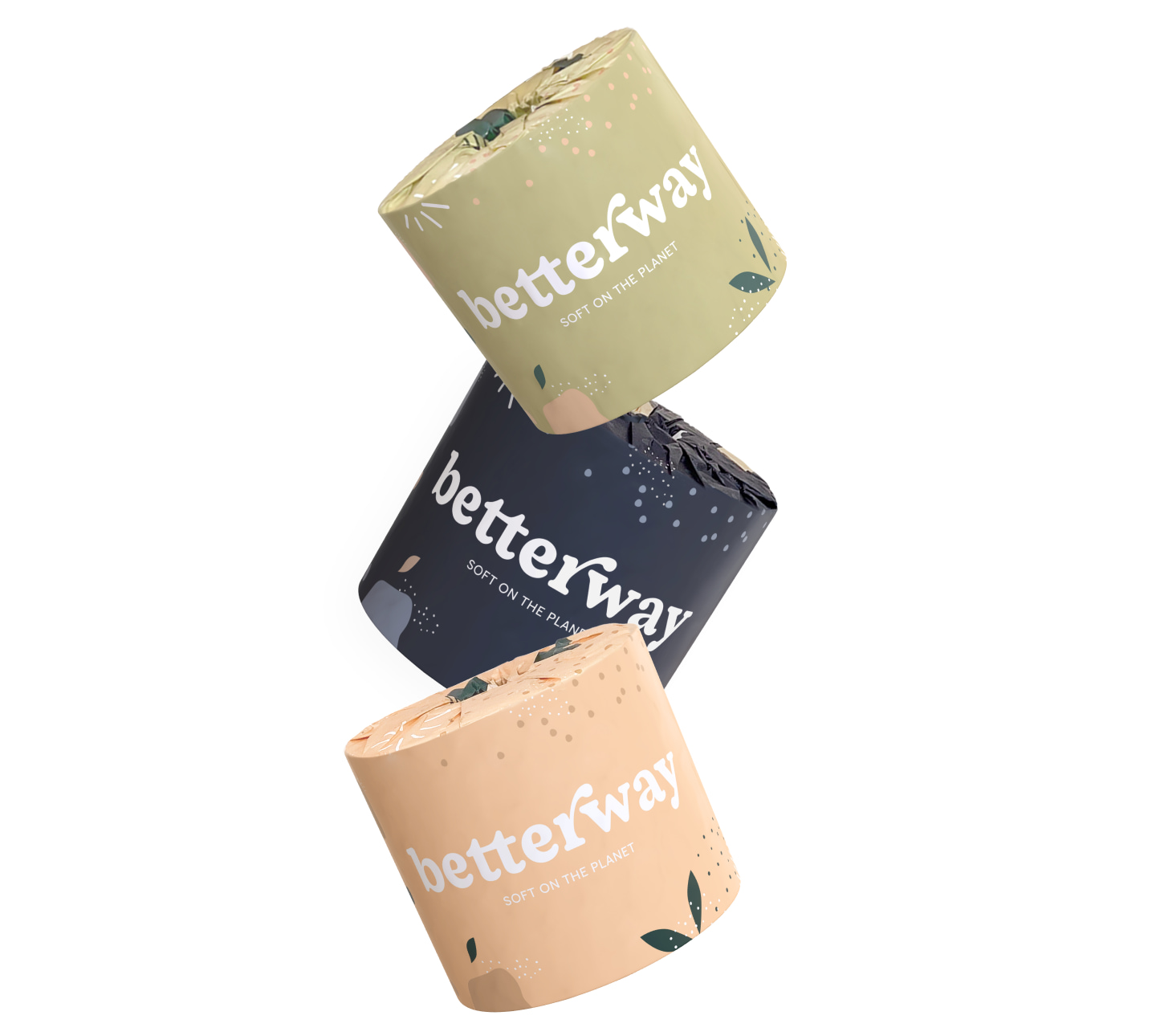
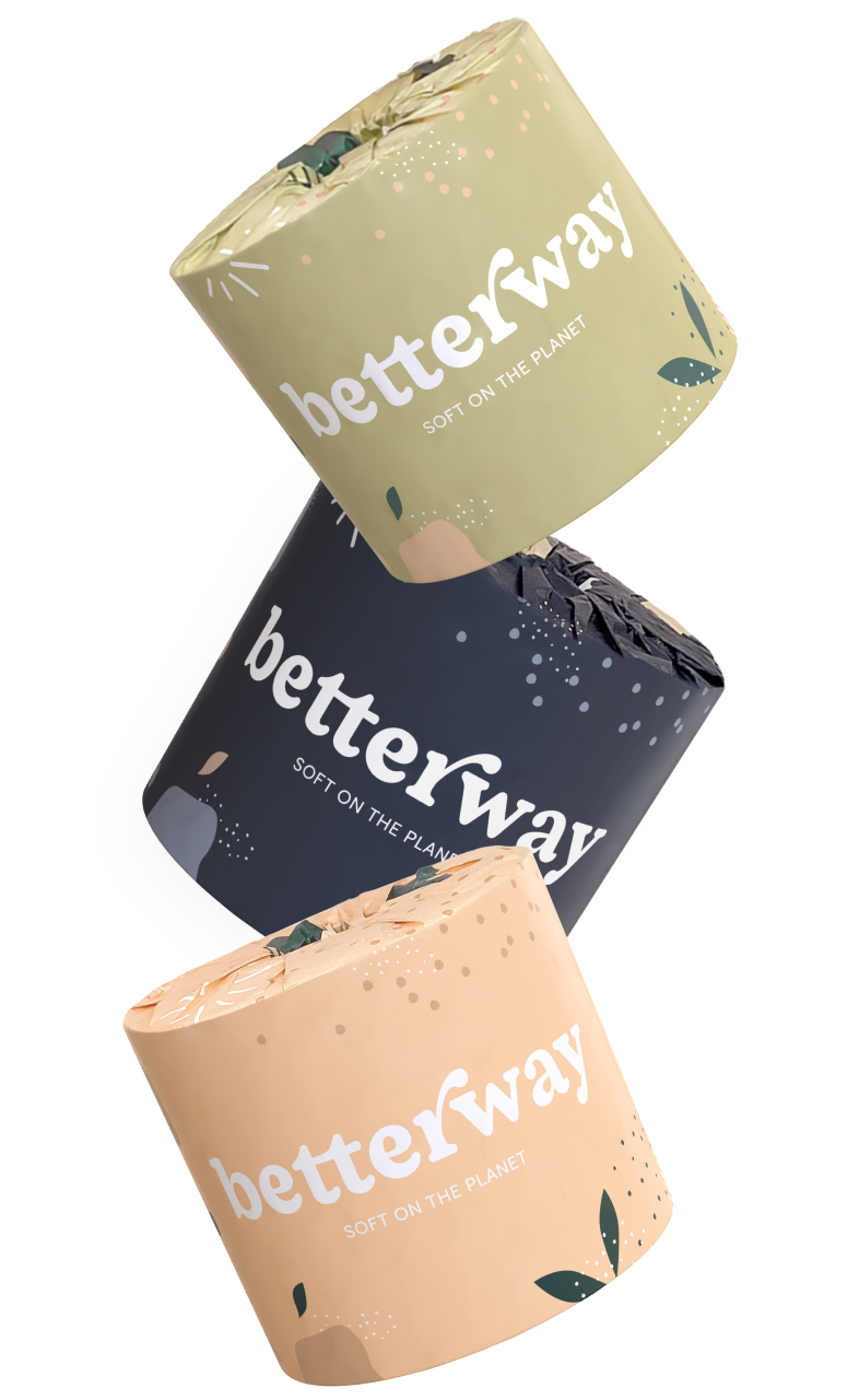
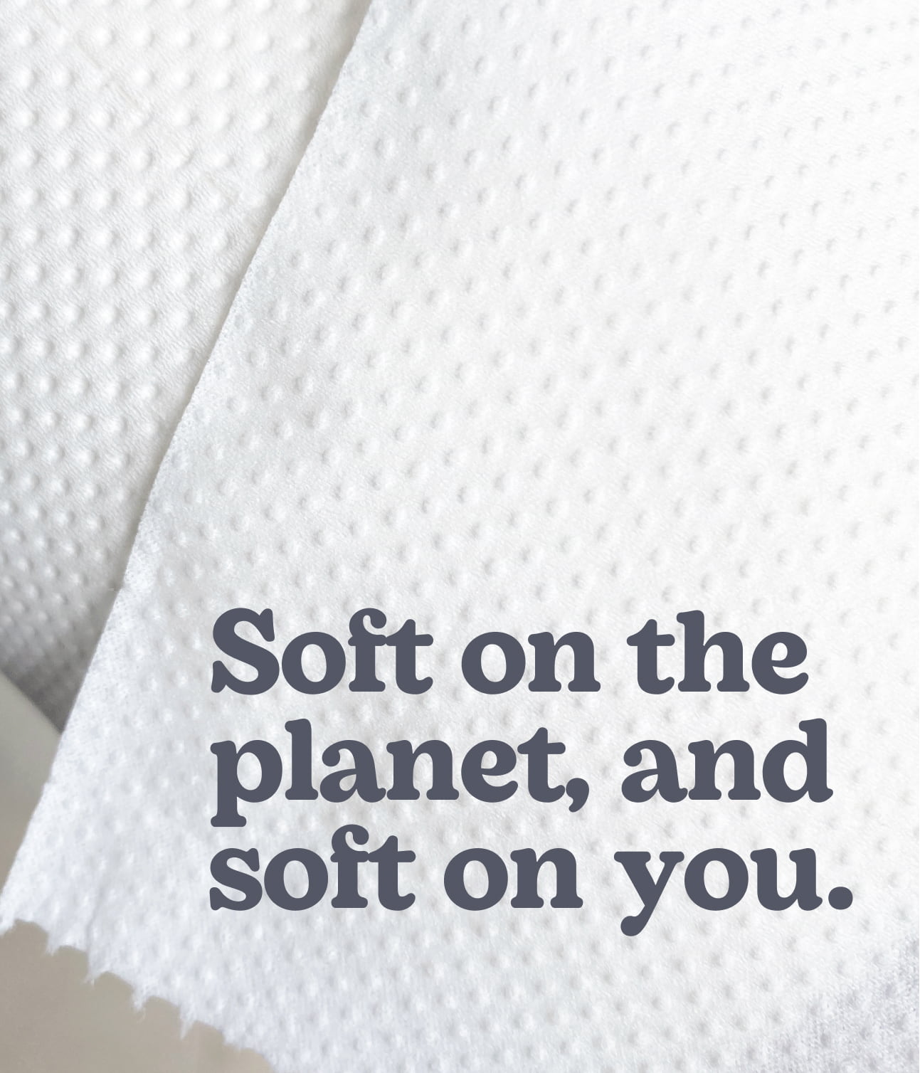
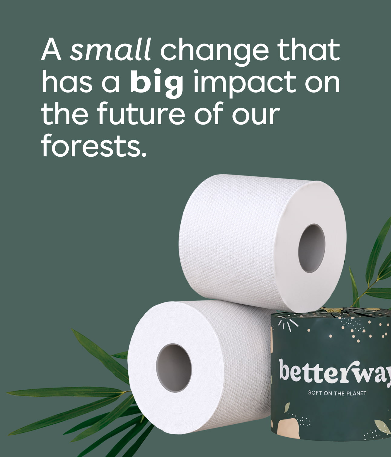
Our slogan, ‘soft on the planet ’, was designed to address the #1 hesitation people have when considering a switch to bamboo toilet paper: ”Is it as soft as regular TP?”
Is bamboo TP soft enough? Absolutely. Is it softer than paper made from wood fibers? Not quite – but that’s the whole point! We shouldn’t be chopping down entire forests just to make ultra soft TP. ‘Soft on the planet ’ shifts the focus from the feature to the mission, reminding the consumer of the true value of making this habit change. Softness is not the main reason to switch, preserving our planet’s forests by avoiding deforestation is.
